“It is the pervading law of all things organic and inorganic, of all things physical and metaphysical, of all things human and all things superhuman, of all true manifestations of the head, of the heart, of the soul, that the life is recognizable in its expression, that form ever follows function. This is the law.“ – Louis Sullivan on design, 1896
I remember when I joined the Android bandwagon 4 years ago when mobile devices were running on the Jelly Bean OS. Features like Google Now and various UI improvements were added for a smoother, more responsive feel. The notification system was revamped with actions buttons along with it being expandable. As a user, I was pretty impressed with the ease of navigation. Then came the era of Android 5.0 and along with it, Material Design.
What is Material Design?
“Focus on the user and all else will follow.”
Google’s first rule in their “Ten Things” philosophy is emphasis on the user experience above anything else. Material Design is a visual language developed in 2014 to cater to the ever-evolving purpose of design. This so called ‘material’ is a hypothetical substance out of which all UI elements are constructed. It must behave according to a number of guidelines setout in Google’s specsheet. This helped Google in developing a single underlying system that allows for a unified experience across platforms and device sizes. Here are a few guidelines:
- No two pieces of Material can overlap
- All Material elements are opaque
- No Material elements can fold or bend
Let’s have a look at the key components with which Material Design is based on.
The principles of Material Design
- ‘Material is the metaphor’ – Google’s design is inspired by tangible objects such as ink and paper. For example, liberal use of grid-based layouts and cards represents the ink and paper which is utilized to express our creativity
- ‘Bold, graphic, intentional’ – Incorporating the foundation elements of print-based design such as typography, grids, space, scale, color, and use of imagery with the intent of being visual guides for users
- ‘Motion provides meaning’ – Google definitely revamped the appearance and layout of their new operating system, but incorporating meaningful animation that serves to maintain a flow to UI is what took the Android OS to newer heights
What makes Material Design stand out?
Material Design draws inspiration from real-world forces. It evidently incorporates concepts like gravity and friction. Another thing to keep in mind is ‘tactile surface’. Imagine you have several sheets of paper that are stacked together in order to create a blueprint for how everything within the design works. These sheets of paper possess the same qualities as that of actual paper; they can change shape and form – they bend, and/or stretch based on your interactions.
Skeuomorphism vs Material Design
As you know, skeuomorphism in design uses life-like elements to represent the real world or in short, a replica of the actual thing. It takes inspiration from Greek style architecture. It attempts to create three dimensional effects on a two-dimensional surface. Let’s take Apple as an example, the previous versions of iOS incorporated skeuomorphism unlike flat design, which is its successor.
You can easily distinguish the two. Skeuomorphism emphasises on lighting and shadows that make it appear like it’s a 3-dimensional design. Skeuomorphism eventually proved to be problematic. Designers stated that it often felt fake because it followed the lines of imitation and ever since, skeuomorphism took to the sidelines. This is when flat design came into being as a response to the problems of skeuomorphism and dominated its way in the digital world.
Flat design takes influence from Swiss style design that began back in 1920. It pushed minimalistic design to a whole new paradigm because it focused on cleanliness, readability and efficient use of space. Have a look at a few highlights of flat design and why it’s replaced skeuomorphism.
- Only uses what’s needed, unnecessary design elements and animations are cut out to drastically reduce loading time
- Colour variety – Flat design is a colourful friend. As a designer you have the freedom to experiment with a range of colours; bold or bright
- Open spaces – Makes practical use of space and thus, keeps your design minimalistic. This eliminates any unnecessary visual elements
Material Design is an evolutionary by-product of flat design. It may appear to be similar to someone not having expertise in the field of design. There is little yet crucial difference between the two. Let’s have a look at how Material Design is a step further of flat design:
MK Cook, UX/UI Designer at Digital Telepathy says that
- Flat design has no skeuomorphisms while material design utilizes them subtly.
- Flat design is best for simplistic needs while material design is best for more complex needs.
- Flat design is overall easier to develop and faster to load than material design.
What makes Material Design so special is its ability to be compatible with a variety of devices like cars, TVs, mobiles & tablets. To tackle this daunting challenge, the platform has a range of tools and techniques for handling various devices. For example, Material Design operates on the basis of density independent pixels (dip). Let’s have a look at how this has helped to overcome various design related obstacles.
Working with density independent pixels:
A density independent pixel is equal to one pixel at the baseline density or 160 dpi (dots per inch)
It’s represented as: 1px/1dp = 160dpi/160dpi where ‘dp’ denotes density independent pixel or ‘dpi’
Working with density independent pixels helps to deal with say two different devices having the same resolution, but occupying different physical space. Thus, you’re able to adapt your design layout in various devices by simply keeping this in mind.
Video courtesy – Udacity
The beauty of Material Design is that it moves beyond app layouts, buttons etc. It’s also a set of guidelines for how we interact with our devices. It emphasizes on movement animation which draws the user’s eye to the correct part of the screen. Google has also released APIs for third-party developers to incorporate the design language into their applications. These APIs let you:
- Respond to touch events with touch feedback animations
- Hide and show views with circular reveal animations
- Create more natural animations with curved motion
- Animate changes in one or more view properties with view state change animations
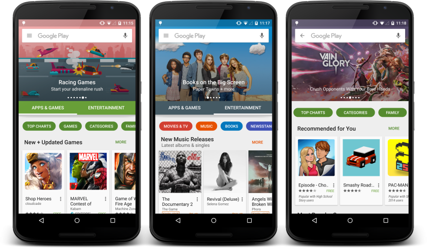
Let’s dive in deeper to understand how Material Design completely revamped the look and feel of the Android OS. Let’s observe the evolution of the Google Play Store from version 3 onwards, all the way to it’s freshest appearance.
Google PlayStore v3 (HoneyComb)
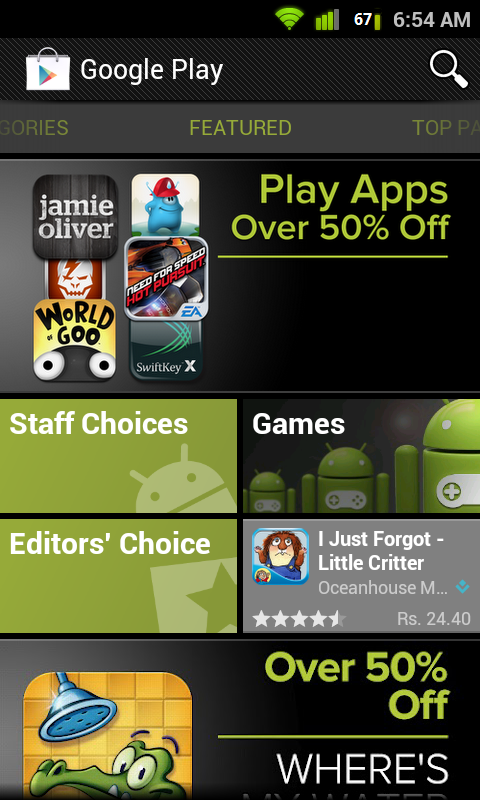
Back when Honeycomb launched, Google introduced a new so-called “holographic” user interface theme. As you can see, the Play Store was predominantly black and had a scroll feature for each app category. The search button was to the top right corner and lacked the sliding menu bar that opens from the left.
Google PlayStore v4 (JellyBean)
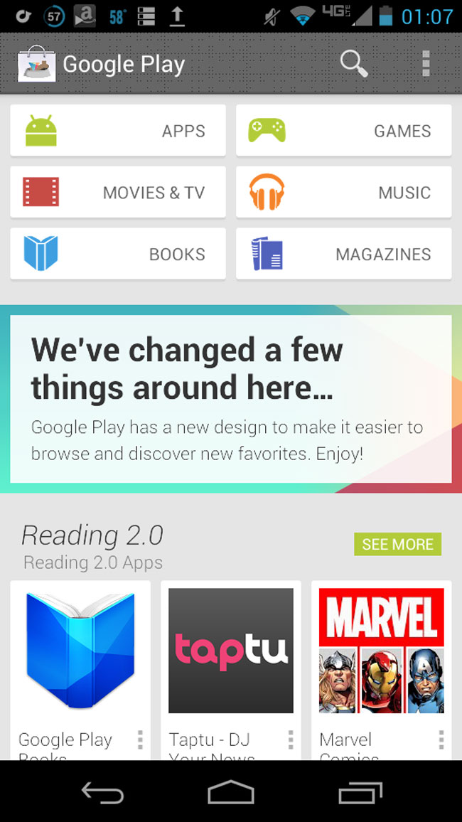
You can notice a considerable number of changes to the Play Store interface. The colour scheme moved to white and still used lush green as a secondary colour. Everything is cleaner, crisp, and polished. Google‘s focused on bigger images everywhere, card style layouts similar to Google Now, and of course recommendations.The app category scroll was discontinued and the use of buttons came into place as you can see in the picture below.
Picture courtesy – androidcommunity.com
Google PlayStore v5 (Lollipop)
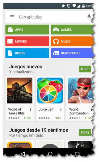
This marked the beginning of Material Design. The side menu (that you can draw by touching the top left icon) became a crucial aspect of app building. It used a persistent search bar that was a lot faster & came with Google Now accessibility. Category buttons were entirely coloured while the icons took to a flat white. v4 was a lot flatter since Material Design started to use subtle skeuomorphic elements like shadows (in the cards below).
Google PlayStore v6 (Marshmallow)
Playstore came out with more minimalistic and lucid version for Marshmallow. Version 6 started to use hero banners to highlight new apps with a scroll feature, app category icons were now using round buttons. It focused primarily on making it easier for users to handle any Android app beta tests that they may want to be a part of.
Picture courtesy – xdadevelopers.com
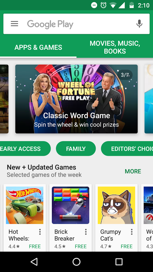
Google PlayStore v7(Nougat)
Material design has come a long way and now has a smarter, sleeker appearance with the launch of Android Nougat. There’s not a lot of difference in version 7 except for the revamped menu as well as a a more intelligent recommendations section. Google will surely add more tweaks and enhancements on the fly.
What I’d like to conclude is that transition animations are of prime focus in today’s touch-oriented society. Google’s Material Design has definitely made user-experience a lot richer and will continue to do so. Material Design is an advisable language to use because it makes development easier owing to the guidelines it must follow. Basically, you don’t have to start from scratch and it doesn’t take much time for end users to understand the UI.
How can Material help your Business?
- Capital – Designing your own UI guidelines has costs
- Uniformity – Adhering to Material Design means you blend into how other apps look
- Time – For larger projects you are guaranteed to come across problems and conflicts if you don’t use guidelines
How to successfully incorporate Material Design?
- Do not ignore the Material grid & keylines since it’s a print-based design
- Since the foundation of Material Design is paper and ink, only use shadows where it matters. Excessive use could cause a lot of noise
- There are a lot of good tutorials and resource sharing websites out there to help you get get started
You can also refer to the following tutorial links to help you get started with Material Design. What are your favourite PlayStore apps that you use on a day-to-day basis? We’d love to hear about it in the comments section below!
There is no ads to display, Please add some


