After writing about GDPR and Themes, Plugins and Logos I’m back to writing about my favourite subject – design. Today I’m excited to write about best practices for designing dialogs to improve UX. Let me first spend a little time talking about what a dialog is.
What is a dialog?
The dialog in design is a prompt or an overlay that requires the user to interact with it to make an action. An example of this is Microsoft Word’s prompt when you attempt to close a document before saving it.
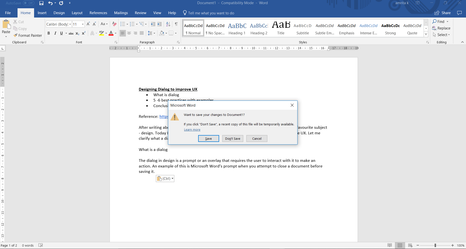
A dialog informs the user :
- That he / she needs to take an action
- Of critical information
- That attention needs to be given to a specific task
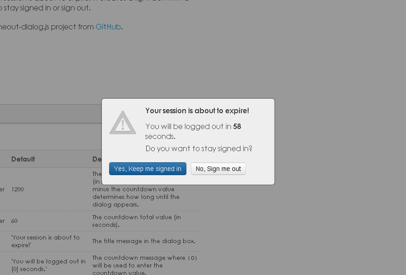
Let’s take a look at some of the best practices for designing these dialogs:
- Limit the number of dialogs you build in: No one likes multiple interruptions. Interruptions force users to stop their current task and deal with the dialog. I suggest limiting the use of dialogs unless absolutely necessary like in the case of a ‘Save’ option in Word. It’s also a good practice to show a dialog only when the user does something like click a button. Sometimes an unnecessary dialog could even put the user off, making him exit the webpage altogether. Like a mandatory ‘Subscribe’ dialog in a blog or a subscription to a newsletter.
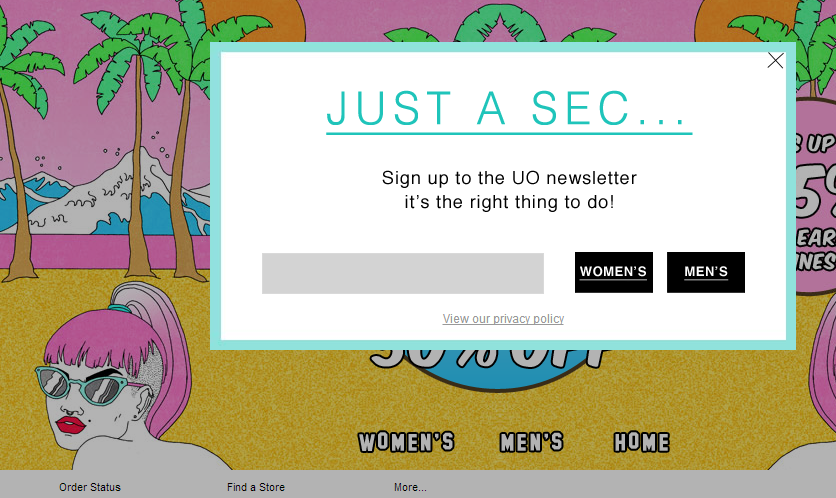
2) Ensure the questions & options are clear: A lot of time, dialogs have language that is not user-friendly. Dialogs should speak the language of the user. Instead of a ‘WARNING’, use a ‘Delete your account?’. The question should be clear with a line of explanation. One way of being clear is to let the user know the impact of his decision. You can do this by providing additional information in the dialog.
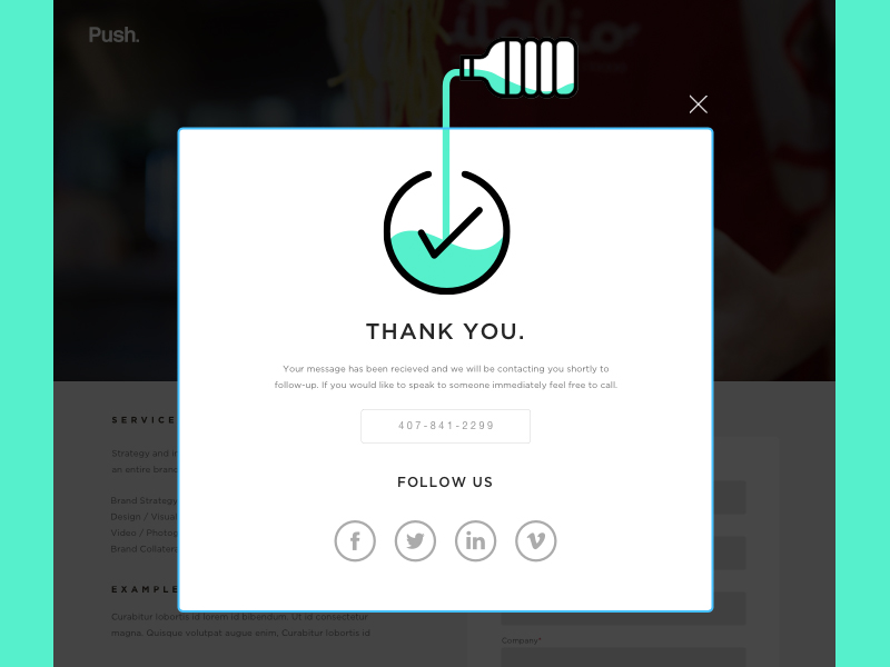
3) Use dialogs to indicate to the user his action has been processed: When an action is complete, let the user know through a dialog.
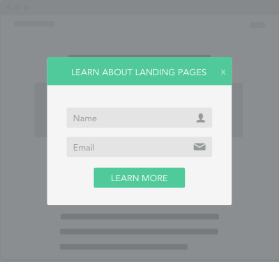
4) Keep it short, silly: I cannot stress this enough – minimal is best. Especially with a subscribe dialog or if you want your user to fill out a form, less is more. Additional, unnecessary fields will only confuse the user. Take a look at this simple, 2-field form.
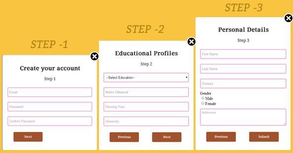
5) Avoid multiple forms within a single dialog: As I mentioned in my previous point, keep things simple. Multiple forms confuse the user especially if it’s on a dialog. A better way is to create a new landing page for the forms. If you find yourself cramming too many elements in a dialog, it’s probably best to create a new page.
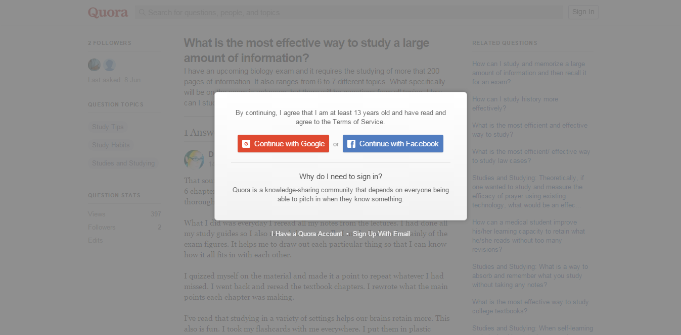
6) The background is important: Using a darkened, greyed out background does a few things:
- It draws the user’s attention to the dialog
- It also lets the user know that can get back to the screen he/she was on once the user engages with the dialog
Keep in mind the graying out cannot be too dark or too light. Too dark can hide the primary page and too light can miss the dialog box, thinking the primary page is still active.
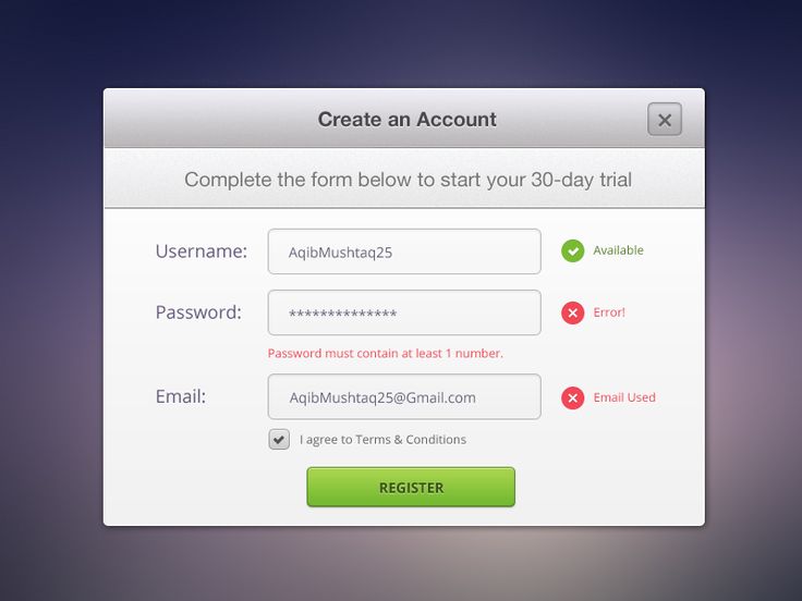
7) Make the ‘Close’ or the ‘X’ clearly visible: Let’s admit, a dialog is intrusive to a user. While it may be to convey something important to the user, it could be frustrating too. It can be even more frustrating if the user wants to get rid of the dialog but is unable to locate the ‘X’ or the ‘Close’ with ease.
Well, that’s a wrap! I hope this article helps you design some fabulous dialogs for your website. Got more tips? Feel free to drop us a comment in the box below. Until the next article, adios!
There is no ads to display, Please add some


