

Can you tell the difference between these two images?
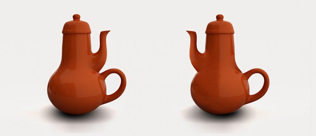
The answer is not very hard to guess, is it?
Usability lies at the nucleus of all ideas. No matter what form these ideas may be translated into – objects, products, software, etc., the significance that they deserve is directly proportional to their usability quotient. Ideas that aren’t usable can only be passed off as good stories. Same goes for websites and applications.
The usability of a website helps users find their way on the website and helps them complete their goals in the best possible way. But how can one ensure that they are hitting the nail on its head when it comes to making websites and applications perfectly usable? The answer is – ALWAYS start with the user-first approach!
Before getting started with any design project, it is vital to answer two questions –
- Who is my user?
- With what intention is he/she coming to my website?
Creating a user profile will help you answer both these questions. This knowledge not only helps in understanding and predicting user behaviour, but also helps in meeting two of the most crucial goals of UI/UX design –
Goal #1: Helping the user find what he/she is looking for as quickly as possible
Goal #2: Reducing cognitive load i.e. eliminating questions from the user’s mind
Even though these goals sound a bit complex, they are, in fact, achievable. Let’s learn about the rules of usability that give direction and guide us towards meeting these goals.
Rule #1: Design an overarching structure of your website
Users often tend to get lost between all the text that web pages are filled with. In order to prevent this from happening, it is important to guide the user to help him/her take the right direction. The key to achieving this is to organize the contents of the web pages.
- Break the content into logical sections in a way that it tells the same story despite being a part of different content blocks.
- Emphasize important pieces of content by using typography.
- Organize the content based on its degree of importance.
- Identify common elements that you want all your web pages to contain in order to maintain repetition and consistency.
Rule #2: Create effective visual hierarchies
Studies suggest that users don’t really read web pages; they scan them to find only those words that closely resemble what they are looking for. Most website visitors only read 20% of the website content because they don’t read web pages the same way as they would while reading a book or a newspaper. Web-users visit websites to get quick answers. This is exactly why prominence, grouping, and nesting are essential concepts:
- Prominence: Using font styles, sizes, and colours to establish a content hierarchy
- Grouping: Using proximity to create a visual closeness between related content
- Nesting: Segregating and classifying content under a parent line to display what is part of what
Rule #3: Use conventions
You don’t have to reinvent the wheel. After years of usage and exposure to specific kinds of icons, colours, shapes, placements, etc. used to convey any given idea, humans have been subconsciously trained to associate the same icons, colours, shapes, placements, etc. with specific meanings. For example, we all know that a logo always sits on the header of the website, we all know that the magnifying glass denotes the search box, we all know that a green button is most likely to convey the affirmative option, so on and so forth. These are tried and tested methods and they have been working fine. So try and stick to these conventional means of representation.
Rule #4: Make your clickable items obvious
Design for mindless clicks. In other words, do not leave any space for confusion when it comes to prompting your users to click on your CTA (call to action) buttons. Make your buttons discoverable by using conventional formats in terms of shape, size, colour, placement, and text. We’ve spoken about designing better buttons at length in this article.
Rule #5: Eliminate distractions
Reduce clutter wherever and as much as you can. Focus on what is important so that even your visitors follow suite. Designers and content writers, alike, find themselves walking a tightrope when it comes to deciding the length of content that needs to go on any given web page, and the amount of design elements that need to be flaunted. Steer clear of unnecessary elements on the web page so as to prevent your website visitors from getting distracted from the main goal that you want them to achieve.
Rule #6: Reduce your content
Get rid of half of your content, and then get rid of half of what’s left. Use a combination of a handful of text and a bunch of lively graphics to say what you initially wanted to say with buckets full of text. Practise minimalism and only keep what is necessary. Your website visitors only read 20% of your content, remember?
In conclusion, we have one thing to say – when your ultimate aim is to convince your users to buy into your idea or even buy your product, you must do whatever you can to help your users find what they are looking for quickly and effortlessly. Try your best, and then try a little more, to eliminate any question marks from popping in the minds of your users. It only takes one positive website surfing experience to pave the way for repeated user interactions in the future; so make sure that you nail it in the first go!
(Originally published as part of our TechTalks series.)
There is no ads to display, Please add some


