
Bright colours, flashing buttons, multiple fonts are all elements that were iconic of the late 1990’s and early 2000’s. Today, these websites look cluttered, ancient & lack taste. A major reason for high bounce rates on websites today are poor web designs. Let’s face it – our website designs are cluttered with too many colours, way too many fonts & navigation that’s the furthest thing from simple. In this blog post, we’ll give you a few basic tips on how to de-clutter that website design and boost the stickiness to in-turn increase conversions.
1) Prioritise: The first step before you even start your design is to decide what it is you want to focus on in this website. As we mentioned in our earlier post ‘Best Practices + Cheat Sheet for Web Designers‘, a good way to do this is to ask yourself if your design fits on a post-it. The exercise will help you prioritise and plan.
In this step, think of what you want your visitor to focus on once he lands on your homepage. This will help you eliminate the unnecessary. Don’t worry about oversimplifying or missing out key elements. There is only a limited amount a visitor can focus on. The trick is to minimalise your content.

2) Limit Your Colour Palette & Fonts: It’s tempting to use multiple colours due to the wide choice available but too many colours can not only make your design look gaudy, it can also distract your visitors from the more important parts of your website, like the content. Keep your colours limited to 3 or 4. Here are some great examples of excellent colour schemes.


Like colours, too many fonts may be a bad idea. It makes for a hard-to-read design & therefore, a less-likely-to-stay visitor. Also, it’s important to take into consideration responsive designs & how your font will translate on various devices.
3) Use Hover Controls: Too many controls will require your visitor to scan through them for the option he/she is looking for. A wiser thing to do is to pick the ones that are more important than others & hide these less important controls from the default view but display them when the user hovers over certain aspects.
Hover controls lead to a simplified interface & no loss in functionality. You may be worried that your user would skip over these or miss it but most users tend to hover on things they’re looking at at the moment & these controls are likely to be discovered quite easily.
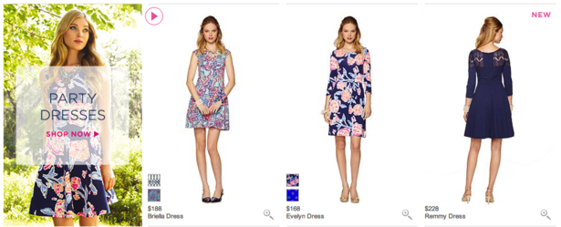
This website displays different angels of the dress once the user hovers on the image, saving space & reducing clutter.
4) Hamburger Menus & Drop Downs: One of the Trends that Ruled 2015 were the Hamburger Menus. What made them so effective & useful were their contribution to the minimalistic feel & their utility. The Hamburger Menu neatly tucked away navigation that previously cluttered websites.
Similarly, Drop-Downs helped hide that part of the website content that could contribute to clutter in the first fold.
Experimenting with the two in your designs can make your design look classy & neat.
![]()
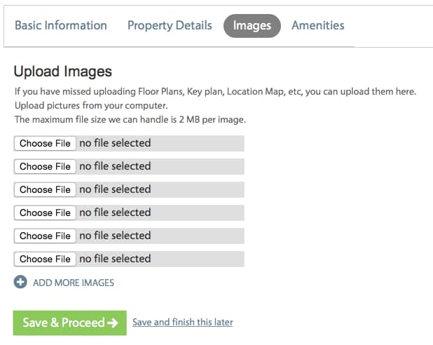
5) Use Expanding Forms: For those websites that have fields for users to upload a file, a small bar with a browse button at the side is quite apt but what about multiple files? Multiple fields like this would add to the clutter on the website. A smart hack is to design expanding forms, where once a file is uploaded, another field would appear underneath. This saves space & cuts down on unnecessary elements.
6) Replace Text with Icons: One of the easiest and most effective ways to de-clutter is to replace text with icons. Even something as important as a vision statement or a brand mission can be represented with icons. This not only makes for effective viewing and greater recall, but for a cleaner, more interactive design.
Try using these effective hacks & see the positive impact they will have on your design. Remember, a good website design always sticks to the point, has a minimalistic feel & enhances user experience, in-turn reducing your bounce rate & perhaps increasing conversions. Get designing & if you’ve got something to share with us, leave us a comment!
There is no ads to display, Please add some


