
Hover effects have always been a staple element of web-design. We see it in blogs, personal websites and not to forget e-commerce websites like Amazon. Animations have innumerable uses apart from adding life to your website. If used efficiently, it helps to guide users with ease towards say a desired product since it drives user engagement.
According to a recent study by Baymard Institute,
- Product listing hover information increases on-site product discoverability and conversion
- 46% of top U.S. e-commerce sites display too little product information in their product lists which results in users losing interest even before they check-out
- Displaying more information on mouse hover leads to less time spent on irrelevant products
So what can we derive from these observations?
Hover effects drive minimal and intuitive design
Let’s have a look at the core factors that are steering us towards minimal design:
- Nature loves symmetry, and beauty lies in symmetry. This is the fundamental principle of design
- We are visually-driven beings and it’s embedded in our cognitive make up.
Now a days, younger audiences like the millenials find hip and lively designs more appealing.
I personally love simplicity since I’m really picky while making a purchase online. The most obvious example I can think of is the use of hover effects in an e-commerce website, especially one that belongs to a visual stimulus driven industry. Keeping that in mind, let’s take Amazon as an example:
- You hover over the ‘shop by category’ button and the drop-down gives you a list of each product category
- within each product category there are its respective sub-categories
- You will notice that there is a structured flow that eventually guides your cursor to the product you desire
- Once you land on the product you’re interested in, all you need to do is just move your cursor over the image
- The ‘zoom’ hover style is used for product cards to give a detailed image of the product you want to purchase
Hover effects are extremely important in maximizing impact and information delivered per inch of screen space while minimizing clutter. Consider the product page for a tangible product like a musical instrument, the details are heavily scrutinized by users for appearance in multiple angles along with its specifications. Thus, hover effects help a user by providing the right information at the right time, without getting a visitor lost in navigation.
Why Hover?
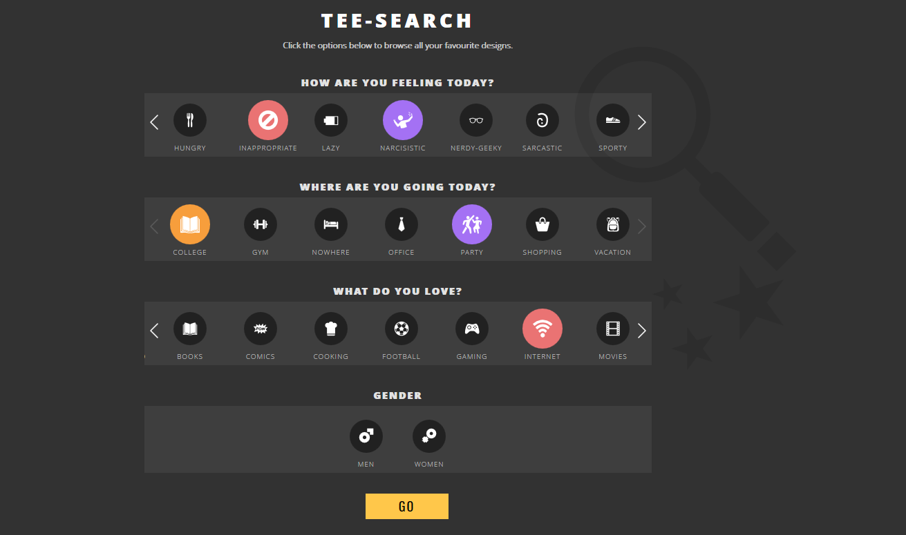
Let’s take another example of minimal web-design. I’ve noticed e-commerce websites selling in-house tangible products (let’s take custom t-shirts for example) like Bombay Trooper, have built their website to cater to the younger generation. For example, the carousel is on auto-scroll and you can select the various categories based on the questions mentioned in the image below. This really caught my attention since it really cut down the use of unnecessary animations just by using a combination of different effects. In short, your landing page must encapsulate everything that your website stands for and swiftly take the user to the desired product.
Different types of Hover Effects
The classic text hover
The book close
The horizontal flip
The mega dropdown
Animations like hover styles enhance the look and feel of your website. The use case of hovers are listless and thus, they’ve been so popular in spite of the shift to mobile devices. Let’s put the use case of hover effects in a nutshell.
- Use awesome effects like photo zoom/shrink, fade etc.
- Efficiently provide the right information to users even before they click
- Users are accustomed to and understand the functionality
- Reduce unnecessary clicks and guide users to the desired landing page
- Reduce a few lines of JavaScript code
We now know that hover styles are slowly turning obsolete because they don’t work for mobile and touchscreen devices. Here are a few reasons that could bug a user:
- Hover actions could hide information that a user is wanting to view
- Unnecessary effects can get in the way for some users and eventually frustrate them (for example, scrolling a web page could cause the cursor to prompt hover effects)
- Hover tunnels can prove to be annoying to older users. I too have had drop-downs close on me because I didn’t follow a specific cursor pattern
However, you don’t get top marks for stating that hover effects are on shaky ground with the rise of mobile usage versus desktop. That’s obvious as the nature of interaction has moved from mouse pointers to touch. Let’s have a look at what are the various factors that could affect the use of hover in design.
The Impact of the Mobile era on Hover Effects:
Hover is a useful element to add to your UI arsenal, but it doesn’t really work well for touch devices as the interaction for click and hover are almost the same (although with 3d touch we might be getting somewhere). Desktops with touch capabilities are of concern as well (like the Microsoft Surface). Here are a few key factors we need to look at to understand how big a problem this could be:
- The sales of handheld devices has picked up 2013 onwards
- Mobile use grows by 58% year over year (according to flurry analytics)
- 80% of users own a smartphone (according to globalwebindex.net)
What we need to keep in mind is that consumers want their devices to be touch friendly. Irrespective of whether it’s a smartphone or a laptop, touch capabilities enables swifter navigation. Eliminating the mouse gives a more user-friendly approach to devices.
Dario Loi, UX Manager at Intel states that 77% of users reached for the screen when they were give the options of using a mouse, track pad or screen.
Thus, it’s not only the increment in smartphone usage, but the shift of wanting touchscreen devices that slowly making web-designers that they can no longer rely on cursors since touchscreen devices do not handle hover too well or at all.
Not to forget that we’re not only eliminating navigation commands with the help of a cursor through touchscreen dependency, but scrolling through menus, using voice control, the rise of smart TVs, Google Glasses etc. don’t rely on a mouse pointer. Hover has been a staple part of web-design and still is. It helps reduce scrolling (mega drop-downs for example encompass everything you need to display to the user) by showing the user everything at once. Hover is such a central part of web-design because it’s such a useful method of interaction and is expected by by users. We’re slowly taking away something that’s been a prime factor contributing to user experience. This could only mean that web-designers would have to revamp their approach.
Hover-like animations / slide-outs activated by a touch for mobile screens effectively increases the number of steps to activate a particular link or function.
Websites need to be responsive in a mobile-friendly world and at the same time evolve towards a framework where the nature of interaction – touch vs mouse/trackpad should feed into the browser or application to deliver the best possible experience to the user.
What can web designers do differently?
The nature of animations that you should use depend from industry to industry. Responsive web-design means that there are no fixed page sizes or other physical barriers. This could only mean that we’re moving to a new paradigm of animations that help improve user interface.
We must offer different interaction styles to touch orientated websites like:
- CSS 2D transformations that are compatible with old or new browsers to give a smooth effect
- The multi-toggle which helps users select a parent category and in turn reveals sub-categories
- CSS3 loads a lot faster than its precursors reducing web page load speed
- A carousel – Adding a carousel to your website helps to keep navigation clean and simple
With hardware capabilities reaching newer heights, the opportunities that come with it make way for fresh ideas from a design perspective. Say you’re playing Super Mario on your iPhone 7 – your controls are pretty simple; left, right and jump. With 3D touch, you can make Mario jump higher just by applying more pressure on your screen. Google Pixel doesn’t have pressure sensitive display though. What it does have though is a feather touch. You can move your finger over your screen and perform various actions just like a cursor!
Virtual Reality & Hover
With VR becoming a huge rage, not just with complex setups such as HTC Vive, Oculus but with more simple ones like Google’s Daydream and Cardboard, hover using the visual pointer has become a key interaction element with or without an additional handheld controller. So hover effects in design will continue to evolve as VR and augmented reality go mainstream. There is clearly much merit in the principle – it is a question of being able to optimize it across platforms which requires that the source be provided information on the nature of device to enable the right UX.
Where does hover stand with the responsive websites becoming a necessity? It’s still too early to take a stand. The use of hover styles will continue to evolve and with it, designers have the opportunity to innovate. What kind of hover effects are you currently working on? Let us know in the comments section below!
There is no ads to display, Please add some


