
Hey there! In an earlier post on Introduction to Website Search, we looked at the importance of the search box on a website, the types of websites that do and do not require search boxes. Continuing with the ‘Search Box Series’, in Part II, we will look at how to design the box.
Frequently Asked Questions & Best Practices
A lot of designers aren’t sure how to design the search box – where to place it, should it have a magnifying glass icon, what the search field size should be, etc. Let’s tackle each of these questions with best practices for designing.
Where to place the search box? When looking for the ideal place to put your search box, ask yourself where your visitor would look first. Results from a study by A. Dawn Shaikh and Keisi Lenz show the expected position of the site search from survey responses of 142 participants. According to the study, the most convenient spot is the top left or top right of every page of a site.
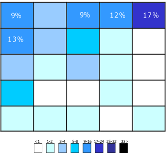
The figure illustrates the areas where participants expected the search to be found. The upper-right corner is still the first place users expect to find search.
While the top corners might be the ideal placement, if the website is content-heavy and you think the search bar might get lost, make it prominent by placing it right in the middle of the page like YouTube & Flipkart do. It really depends on how critical the search bar is to your business & website. Amazon, eBay and Google all have the search bar at the top center as search is important to the visitor’s navigation experience in these cases.
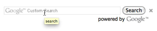
What to name the submit call-to-action? What should you name the search submit button? Should there even be a button at all? Can I use a magnifying glass icon instead? These are some questions we consider while designing and to answer that, yes, you do need a button. Reason being threefold:
- Many users are still habituated to clicking a submit button.
- It makes the search field more prominent.
- A magnifying glass on the search bar itself would mean the user has to precisely point the mouse over it. A large clickable area makes it easier for the user especially on the smart phone.
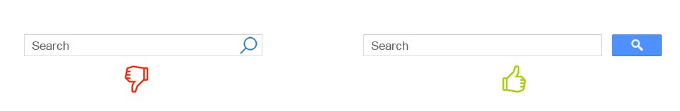
Additionally, you could name your submit button as Submit or Enter, Go or Search.
Should the search box be on every page? This is a big one. If your website is large enough for a search box in the first place (does your website needs a search box), then yes, every page should have a search box. If not, the users will have difficulty looking for what they want and will ultimately leave.
A good practice when designing the search on every page is to be keep some things constant:
- Placement of the search box – If it’s in the center on the homepage, keep it that way in all pages
- The styling, box size & submit button – Again, keep it the same as the homepage
Here’s an example from IMDB.
Their homepage:
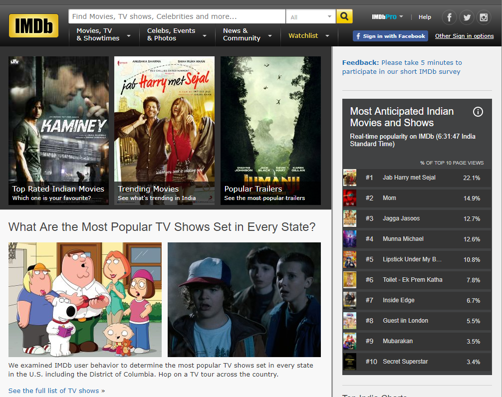
A show page within the website has the same search bar – styling, size, length etc.
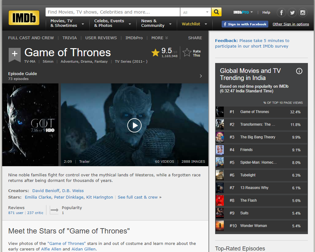
The reason for this is that once the user is able to locate & familiarise himself with the search box on the homepage, a change in the box in subsequent pages will break the UI flow and make for unpleasant user experience if he has to locate and familiarise himself with the box on every page all over again.
What size should the search field be? This is probably one of the most overlooked design aspects of the search box. All too often, search bars are short in length. While they still serve the purpose, when long queries are typed in, only a portion of the text is visible which makes for bad usability. I find this to be especially annoying on my phone when I need to edit the query or review it.
Again, take reference from well-known brands. Amazon is one such example of a good search bar length.
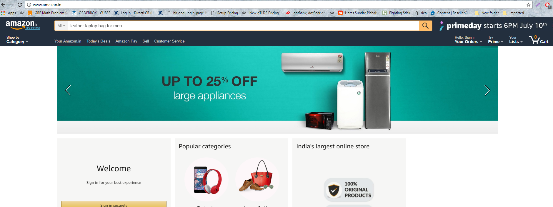
I did a little research myself on the length of the search (measured by numerical characters that I typed from 1-x) of a couple of popular websites at the top of my head and here are the results:
- Amazon – 75 characters
- Flipkart – 54 characters
- Google – 33 characters
- Mashable.com – 33 characters
Jacob Nielsen’s recommendation (in 2002 – I know it’s old) suggests a search should be at least 27 characters wide.
Should I have auto suggestions/search prompters? Auto suggestion is the functionality built to aid users’ search by attempting to predict what the user is looking for based on what is entered. The purpose isn’t so much to speed up the search process as it is to guide the user since users are historically poor at entering search queries.
Many ecommerce sites use this functionality well. Here’s an example from Flipkart:
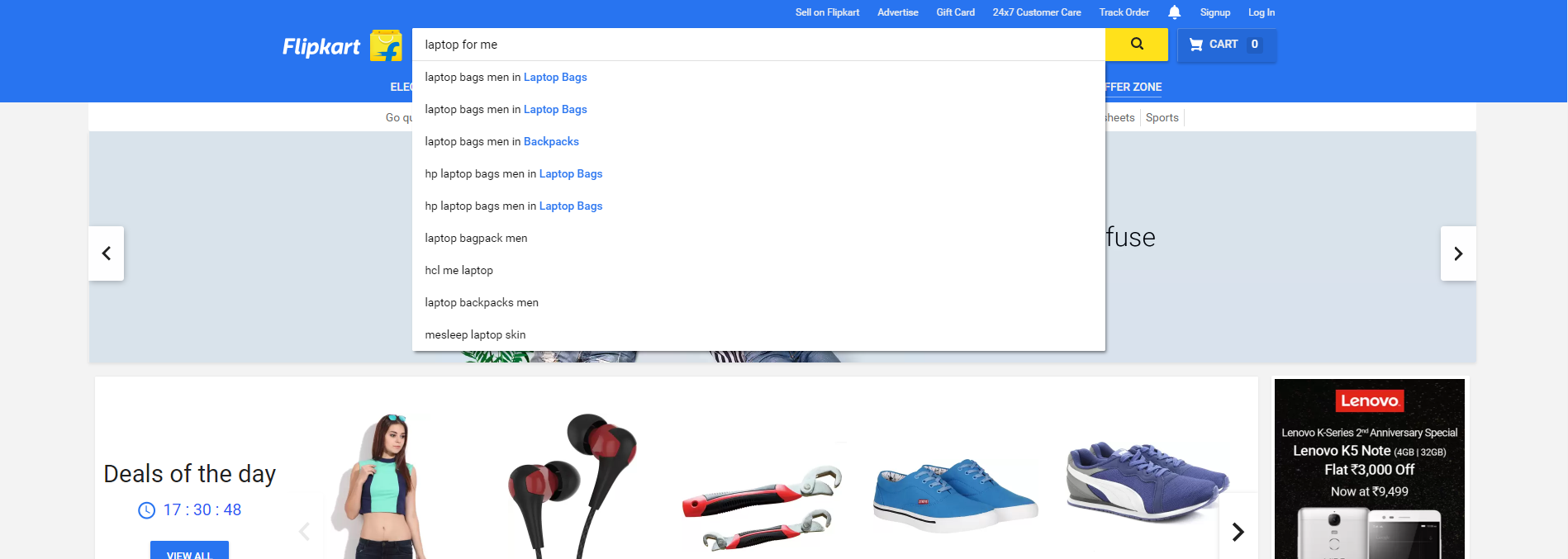
An alternative to this is a sample search suggestion that again, serves the same purpose of guiding the user’s search.

Frequent Mistakes in Designing the Search box
- Making the search box hard to find
- Not putting a search bar on a content heavy site

- Making the search field too short

- Making the search field non-editable after a query input
- Providing multiple calls-to-action for a single search box
- Not providing a call-to-action at all

- Over-designing the search box so much so that it’s hard to find

Conclusion
I hope this article is some help to you when you’re designing the website search. I will be covering the technical aspects of designing the search with respect to technology, indexing and algorithms in Part III of the Search Box Series so stay tuned for that.
In closing, I’d like to leave you with an interesting read on why Wikipedia moved their search box and the results of their own research in the article Usability: Why Did We Move The Search Box?
Tell us what you think in the comments below!
There is no ads to display, Please add some


