
Back in 2015, an Ericsson study forecasted that by 2020 70 per cent of the world’s population will be smartphone users.
Three years later, it appears the study’s findings still ring true, as 51 per cent of the total global internet traffic now comes from mobile devices.
It may seem like a natural progression for users, but for designers, this further highlights the importance of embracing a mobile-first website design. And although there is an increase in app usage, mobile-first design continues to be advantageous as it makes any site compatible regardless of operating system or device used, allowing businesses to reach a broader market. It also costs less to upgrade a website, instead of maintaining multiple apps across different mobile platforms.
Just as how important hosting is when laying the foundation of your website, you should also look at designing with mobile users in mind. Below is a brief discussion on mobile-first designs, why it’s important, and a guide on how to develop and test a site using a mobile-first design.
Building websites for mobile devices
At the start of the decade, designing mobile first was a strategy that suited certain companies. But as the world continues its steady march into the digital realm, it’s also becoming increasingly mobile.
With nearly 5 billion people using mobile phones to navigate the web and apps, building mobile-first is no longer just a strategy. It’s a priority.
What this means
In the most basic terms, mobile-first is a design strategy that began with conceptualizing for the smallest screen first, before eventually moving up to larger screens. A part of this was also referred to as progressive advancement – that is, designing a version for a relatively lower browser, with only the most basic functions and features.
It may seem natural now, but just five years ago, mobile websites were considered almost an afterthought in the design process. Back then, designers focused on giving desktop users the best UX experience.
It’s about delivering the right user experience to the right device. And today, the most commonly used devices are mobile.
Since the starting point of being mobile-first immediately considers restrictions like bandwidth and screen size (among others), designers need to seize product key points, aiming for a lean and clean product, with certain prioritized features.
Advantages of mobile-first design
- Google factor
Google has already said that it is looking to implement its mobile-first index. This means that the mobile version of your website will be the starting point for what Google includes in their index – essentially becoming the baseline for how their rankings are developed.When this becomes the SEO reality, your mobile-optimized website will likely rank well on both desktop and mobile devices. On the flipside, if a search term or phrase isn’t represented or flopped to mobile users, there’s a likelihood that the page will underperform.
- Strong foundation
When you build a mobile-first design, the most important elements of the product are part of the starting point. When done correctly, this translates to having a strong foundation, which can eventually be used to strengthen designs for tablets and desktop. Content is king even in mobile-first design, where navigation takes a backseat because users need to get information quickly.Mobile-first design forces designers to focus and maintain clarity by removing unnecessary UI. With a more focused design sans distractions, improved UX usually follows – which always makes good business sense.
- Speaking of business sense
Mobile conversion rates best the average desktop conversion rates by 64 per cent. As well, mobile advertising is projected to reach $46 billion by 2019. And you definitely want a piece of that giant pie.Since approximately half of all online searches are conducted on mobile devices, designing with that in mind allows you to provide better customer service by being easily accessible based on the device they are using. This would also benefit you marketing-wise, as 57% of users will not recommend a business with a poorly designed mobile site.
How to Develop a Website For Mobile
It’s important to keep in mind that a mobile user will have different needs than a desktop user. Whereas a desktop user tends to look for more in-depth information and more features, mobile users need their information as quickly as possible – which is, again, why content takes central focus.
- Content inventory and visual hierarchy
This is basically a document listing all the elements you want to be included in your streamlined mobile-first design.
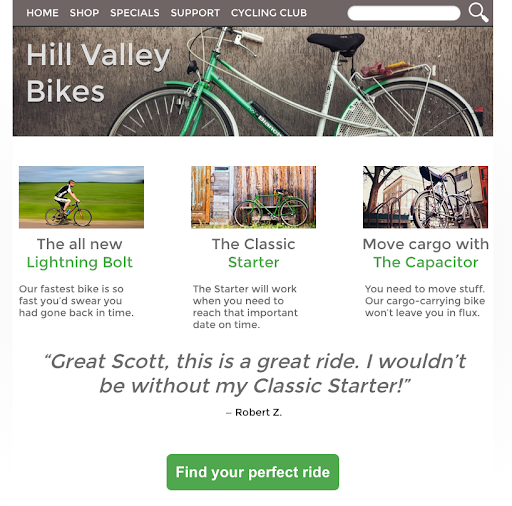
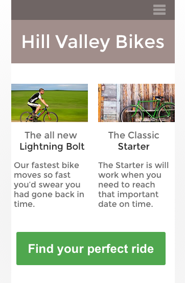
Source Taking UXPins’ example, a bike manufacturing company might have the following listed by order of importance:
- Website name
- Latest model
- Best-selling bike
- “Find your perfect ride” CTA
- Navigation
- Search
- Second best-selling bike
- Gift certificates
- Testimonials
- Latest blog post
Compressing that into a mobile screen might look like this.

Source In this example, sales is obviously the bottom line, which is why highlighting the top-selling bike and the company’s latest model take centre stage. The CTA is also made as prominent as possible.
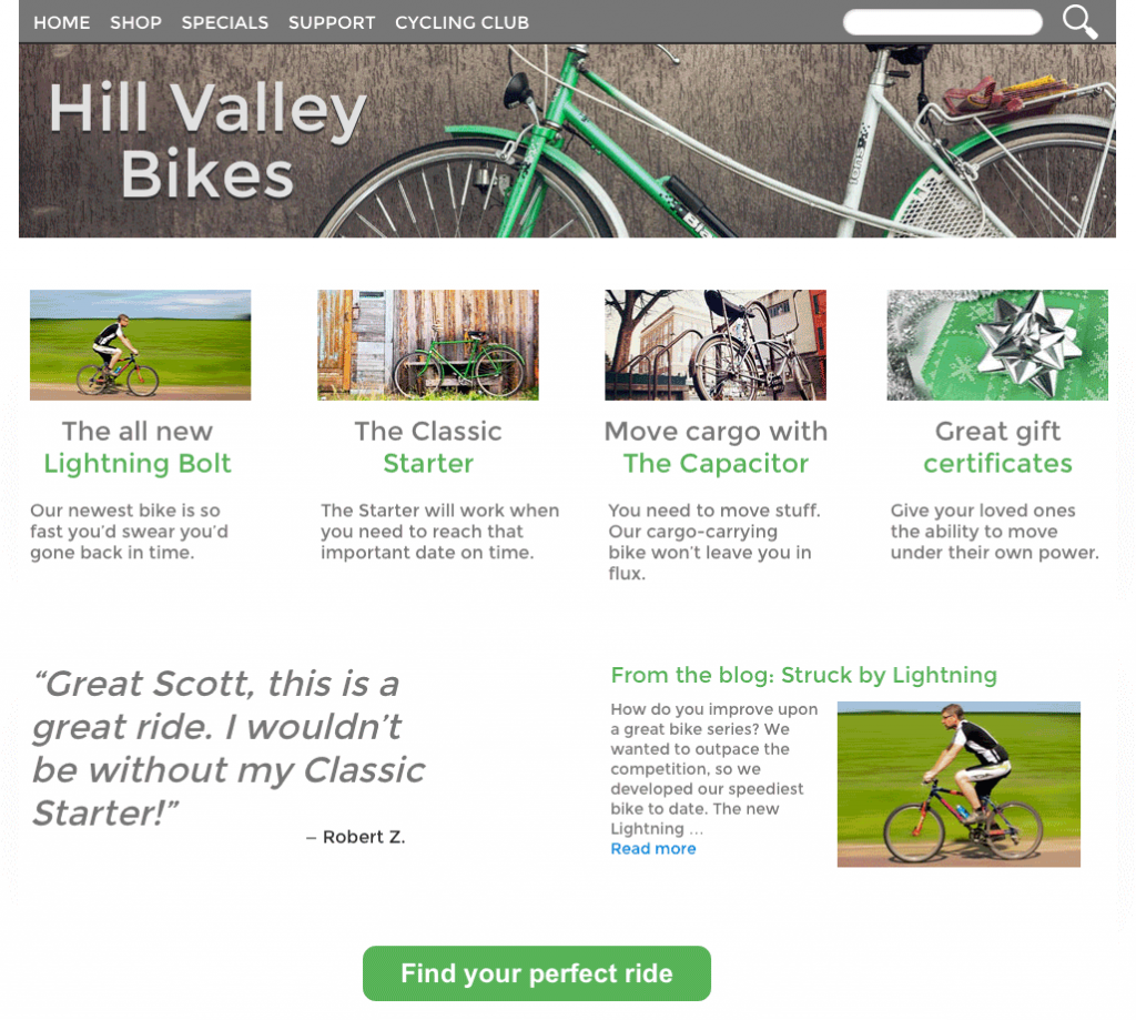
As you move on to tablet screens, you also move down your list of priorities as you can see here:
Source Secondary information and expandable navigation are added, with a testimonial at the bottom of the screen complementing the CTA.
An important point to take note of is that the lines between secondary and tertiary information become blurry at this stage. You need to resist the urge to condense too much information on the screen. This is why having a content inventory and hierarchy helps.
When you decide what to leave out, it’ll also make it easier to fill out the screen as you transition into a desktop, as you can see here:
Source You’ll notice that the link to Gift certificates and the latest blog post have been added.
- Design device-appropriate layouts
Of course, there are many UX design platforms. But sticking with UXPin, you’ll find it’s fairly easy to create different layouts for different screens. Of course, there are plenty of UX design platforms out in the market that will help you build a mobile website, such as Fluid UI, Marvel App, and WebFlow.Of course, there are many UX design platforms. But sticking with UXPin, you’ll find it’s fairly easy to create different layouts for different screens. Of course, there are plenty of UX design platforms out in the market that will help you build a mobile website, such as Fluid UI, Marvel App, and WebFlow.- To start, open a UXPIN prototype and tap “add responsive version.”
- You can either choose a preset size or enter your own dimensions. An added feature is that you don’t need to recreate everything from scratch, as you can choose a size from which to copy your design’s elements.
From there, you can easily switch between breakpoints by tapping the different sizes above your canvas, which you can adjust depending on your needs. For a comprehensive HTML guide for mobile-first design, click here.
Mobile-first Design Best Practices
- Save the navbar for later
As you might imagine by now, on mobile, maximizing space is of the essence. And a great way to create more space for more important elements is to drop the navbar. Again, navigation takes a backseat to content on mobile, so while it’s incredibly helpful, it doesn’t necessarily fit mobile users’ needs.This is why the hamburger menu has become the go-to option for almost all designers. This drawer allows users to pull out the menu items only when they need it.
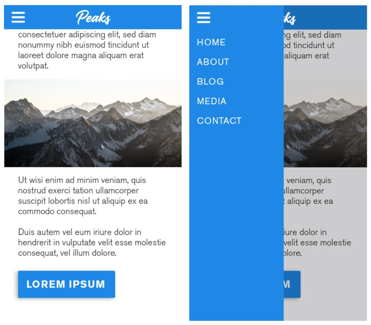
Source - Front and centre
You know what you want your audience to do. Now put that where they can easily reach it.
Do you remember the first iPhone? It seems like such a ridiculously small screen compared to the giant phones we have now. So as you might imagine, the way our thumbs interact with our phones has changed as well.Because phones have gotten bigger while our hands have stayed the same, the screen hotspots have changed as well. The outer screen’s edges take much effort to get to now as you can see here:
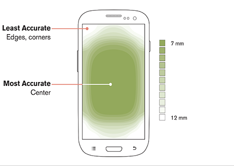
Source Designers today need to organize content in a way that puts primary interactions front and centre, with secondary and tertiary functions for the top and bottom screen edges.

Source - Mind file sizes
The bigger the file sizes, the slower the load time. Add to that the fact that mobile connections are less reliable, then you not only lose users’ patience; you also lose rankings. This is why you need to make sure that all file sizes are optimized.Tools like Photoshop’s “Export for Web” make sure you minimize the file size of images before uploading them to your site. Of course, you’ll have to keep in mind what the images are for, where they’ll be placed, and how big they should appear. You want to keep your at a high enough quality while reducing file size as necessary.
One example is if the column where the image will be placed is 600px wide, you don’t need an image that’s 1000px wide.
- Link what matters
Mobile users want information and action. And they want it fast. This means you need to make accomplishing what matters as streamlined as possible, taking as few taps as possible.For example, if reaching you via phone or email is a key element of your service, make sure that information is clickable. This way, when they tap on your phone number, it automatically takes them to the actual phone part of their phones.
Similarly, your physical address would be best served it if it linked to Google Maps. It’s the little things that matter in mobile-first design, so link to them!
Takeaway
Delivering the best UX is the name of the game these days – a game which is increasingly played on mobile devices. And this works both ways.
As a designer, you build a strong foundation that allows you to increasingly incorporate elements into your design as you move on to larger screens. For users, you’re providing a pleasant experience that will keep them coming back.
Is your website optimized for mobile? What improvements are you thinking of implementing? Sound off in the comments section.
There is no ads to display, Please add some


