Motion has become an important element in design. Google explains motion in web design as ‘Something as simple as tapping a card to expand and reveal more information is made better by fluid animation’. The reason why motion in web design is important is because:
- It engages the user
- It gives the user a sense of control
- It allows for fluidity which results in seamless user experience
- Is an indicator that an action is in progress
To elaborate on the last point, at one of our Ctrl+F5 events earlier this year, Anish Tripathi (VP Product Design at BookMyShow) made a point in design that stayed with me. He said if a user on a website makes an action for example like clicking a button, – that reloads a page but does not see any motion like a loading icon, it can be frustrating user experience as the user does not know what to expect. He/she is forced to assume your website is down and will instantly click away to another site. That’s exactly what makes motion so important. It makes your website communicate.
I’ve grouped motion into two kinds on the basis of my understanding:
- Interactive
- Passive
Interactive Motion
Interactive motion as I’ve classified it is where the user interacts with the design to make it move. His action causes movement. This is the kind of motion that gives the user a sense of control. Let’s take a look at what motion elements are interactive:
Hovercrafting: This is the motion that occurs when a user hovers on a particular word in a text passage. Hovercrafting is a motion that focuses on the little details using varying fonts, styling or word background.
We’ve covered hover effects in depth in The Future of Hover in Design – impact of Touchscreens, VR & more
Pull-out menu bar: This again is interactive motion in this, the user can choose to expand the information he/she is viewing on a screen through a slider. Without the user action, this motion does not take place. Pull-out sliders can be easily tucked away with a hamburger menu.
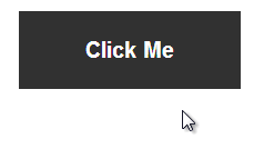
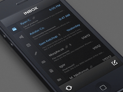
Progress bar: Progress bars aids user experience because it lets the user know how far she/he’s reached in an article, or how close she/he is to finishing a survey so she/he can evaluate if it’s worth his time. A progress bar or animation can also indicate how long the action she/he has made will take to be implemented.
Scroll bars: Similar to progress bars, scroll bars give the user control and let him/her know how close he/she is to the end of the page (unless it’s an infinite scroll). Many designs have jumped on the scroll bar trend and moved away from the traditional function of a vertical scroll to creative parallax scrolling.
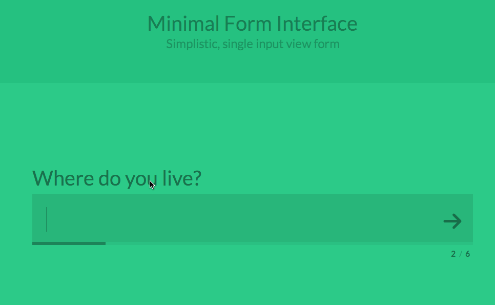
Forms: Some creative ways of revamping the conventional form is by adding motion. Once the user has answered a question and hits the arrow button, the next question rolls after her/his action.
Passive Motion
Passive design, as I’ve classified it is motion in web design that are not dependent on the user’s action. This motion happens irrespective. Let’s take a look at some design elements that qualify as passive motion.
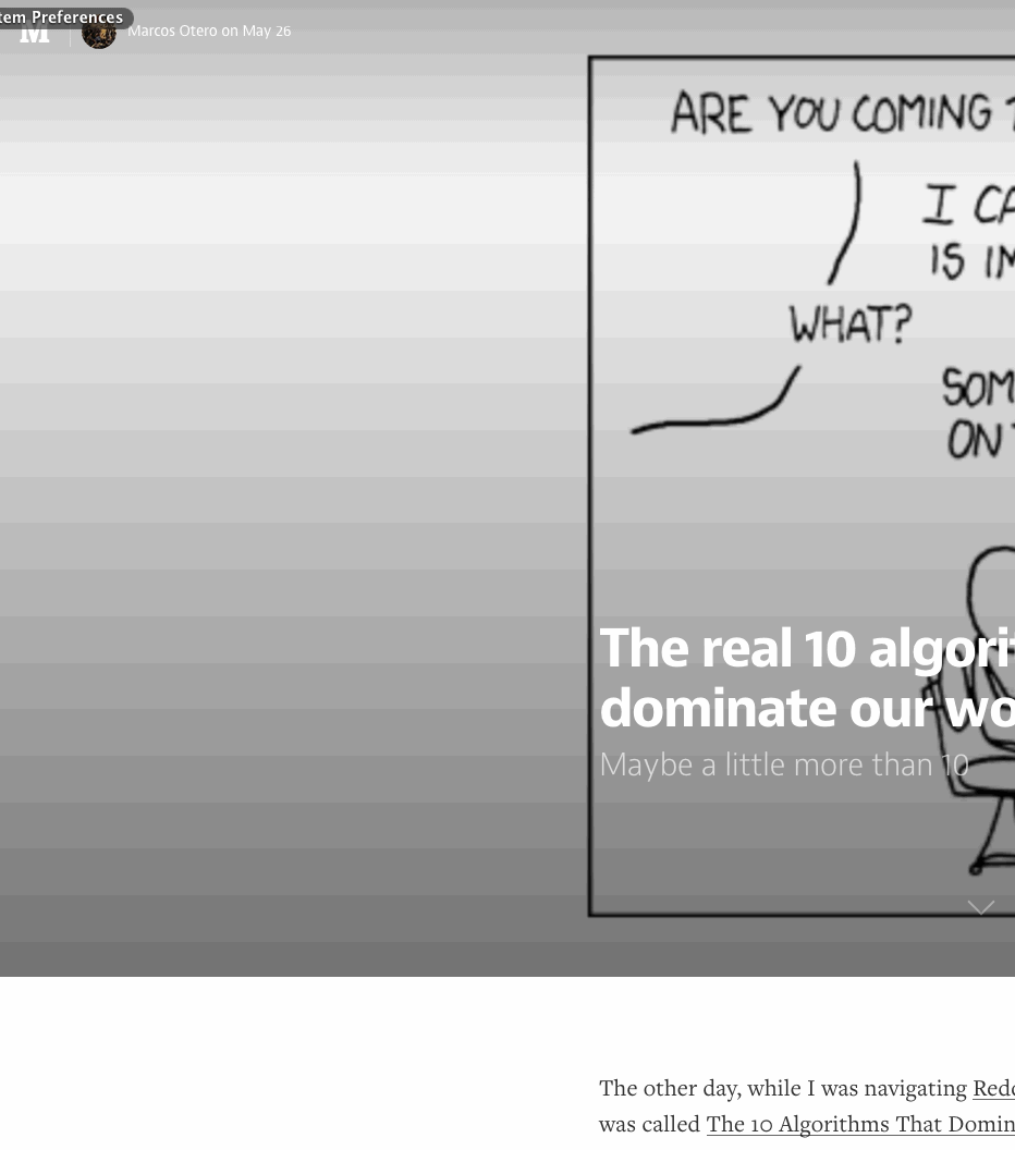
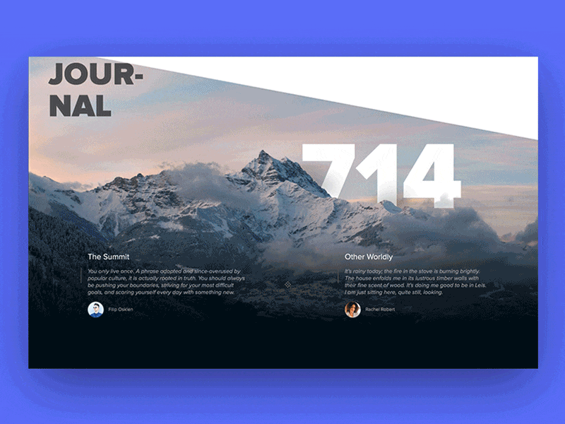
Website background: This is probably one of my all time favourite motions – to see animation or video in hero images or homepage sliders.
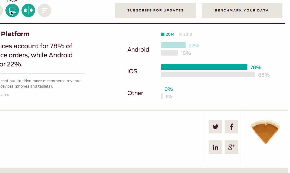
Dynamic charts: I love how motion has been used to make data visually appealing with dynamic charts. Dynamic charts can be made to auto-load when a user reaches a section on his/her screen. They make for interesting design & retaining user attention.
Loading: Patience is not a virtue most of us have when it comes to website load speed, hence the loading icon. Most of us are very familiar with the loading icon and know what to expect when we see it. However, if you only saw a static loading icon sans motion, you’d probably think your internet connection is slow and your page is stuck. Motion in a loading icon not only lets you know how soon you are to viewing what you came to see, it also lets you know that something is happening on the page and your only action is to wait.
Conclusion
Motion has been one of the most popular design trends in recent times especially with mobile devices. Smart & touchscreen devices opened up opportunities to play with designs, transitions, parallax scrolling, pinch, zoom & more. I want to leave you with my favourite website background motion for this month. I promise you won’t regret seeing it: https://www.vistabluesingerisland.com/
Images courtesy: Dribble.com
There is no ads to display, Please add some


