
Pagination is a way to structure content on any medium – by grouping them by a fixed amount of space or number of elements. On websites, Pagination is simply the number of pages you see displayed at the bottom of a web page that serves to separate content for easy consumption. It is often the most overlooked element in design but arguably one of the most important. I say ‘overlooked’ because many believe the myth that users don’t scroll, making pagination obsolete. Research however, proves otherwise. An interesting finding from MOVR suggests that on mobile, half of the users start scrolling within 10 seconds and 90% within 14 seconds. In July 2011, Apple removed the scrollbar from Mac OS X (it’s the default setting, though users can put it back). This clearly shows that people are so familiar with scrolling that they don’t even need the visual cue for it.
Now that we’ve established that users do in fact scroll to reach the pagination at the bottom, it’s important to design it right. However, before I delve deeper, it’s important to acknowledge that pagination has limited use-cases. It largely depends on the content & context. Google, for example uses pagination because Google wants to give you the best results on the first page and also because thousands of search results can be overwhelming if they’re not page separated or if presented with an infinite scroll.
Let’s look at some best practices for designing the pagination:
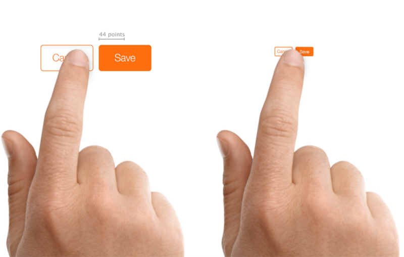
1.Ensure large clickable elements: Many designs underestimate the importance of the size of pagination buttons. While this holds true for any call-to-action or button as well, it is especially important in pagination for a smooth user experience. A target that is too small can cause the user to accidentally hit a button to the left or right of the actual target especially on while viewing on mobile. The suggested measure is at least 44 points x 44 points to be accurately tapped with a finger on mobile.
2. Ensure enough spacing between elements: Going hand-in-hand with the previous point, spacing between elements ensures the user does not accidentally click on a target he doesn’t intend to.
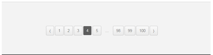
3. Clearly indicate the page the user is currently on: To successfully navigate, a user needs to know which page he is on currently. The understanding being, he really isn’t keeping count if he’s on the 3rd page or 5th page. Therefore, there is a need to identify the current page with a styling (not just colour) that’s different from the other pages. Additionally, ensure the current page isn’t linked.
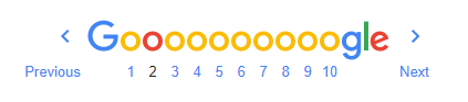
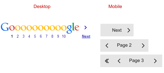
4. Numbers vs. Previous – Next: Next & Previous links are useful for users if they’re used in addition to pagination. Google uses both with styling that’s different from the number elements and placed far away from the numbers so as to avoid confusion.
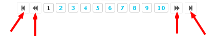
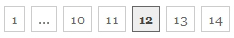
5. Avoid First & Last Links or double arrows: First & Last links on the other hand create confusion. They’re indicated by double arrows which can be mistaken for single arrows. The practical value in adding double arrows is that it enables the user to directly jump to the first or the last page with a single click in the case where he knows where the content he is looking for lies. Even so, the double arrows aren’t the best option. An alternative to the double arrows is the ‘…’ with the first/last page number visible no matter which page the user is on.
6. Keep mobile in mind: A good design is one that’s responsive. Ensure you optimize for mobile, tablet and different screen sizes. This however does not mean merely aligning the page with the device screen size. It requires a little more intuition than that. While on a desktop, it is wise to provide a list of pages, for mobile, only the essential elements should be displayed. The essential being the current page number, First Page, Previous Page & Next.
7. Should you provide manual input? Manual input is where users can directly input into a blank field the page number they would like to see. This can eliminate the frustration of hitting ‘Next’ or ‘Previous’ which allows you to browse only one page at a time especially if you do know the page you want to head to. You could then use both to enhance user experience.
Conclusion
It can be tricky getting pagination right but if your pagination design serves the primary purpose of improving navigation, you’re doing fine. It’s important to note that pagination is not really intuitive so over designing by adding too many elements or even using multiple colours can confuse the user. Stick to simple navigation for smooth user experience.
In the more recent years, alternatives like menus, navigation bars & categories haves reduced the phenomenon of numbered pages however, it still is relevant in specific use cases- for search results, for blog sites & possibly product sites (like Amazon). Google’s Gmail inbox uses a variation of pagination by displaying range of items.
There is no ads to display, Please add some


