
When it comes to designing or improving the UX of a website, how often do you consider your terms and conditions page? My guess: hardly ever. I know what you’re thinking, “why spend time improving a page that 99% of people don’t read when I should be working on my homepage, pricing page, checkout page, etc?”
To be clear, you should definitely pay more attention to the design of these pages, but there is a case to be made for giving some tender love and care to your terms page. This article outlines three reasons why you should, and offers 6 no-hassle ways to enhance your terms of service page.
Wait…What Exactly Is a Terms & Conditions Agreement?
First things first, before we cover the reasons you should improve the UX of your terms page, let’s quickly review what a terms and conditions agreement is. A terms and conditions agreement (also known as a terms of service or terms of use) is essentially a legal contract that outlines the rules that visitors must abide by when using a website or app.
The purpose of this agreement is to protect both owners and visitors, and ensure the website or app offers the intended experience. While there is no overarching law requiring every website to have a terms of service page, without one, a website is legally naked in terms of protecting its ownership rights over its content (designs, articles, etc).
3 Reasons To Improve Your Terms & Conditions Page
If you haven’t paid much attention to your terms page or don’t think there is any value to doing so, here are three arguments that should convince you to fix that page as soon as you’ve finished reading this article:
- Build trust in your brand
When a visitor is able to understand a terms and conditions, they feel reassured that they can explore a site without fear of getting taken advantage of or scammed. It’s a breath of fresh air to be able read through and understand a website’s terms in the first go. It shows that the company actually cares about its users.
On the flip side, if visitors have a hard time just getting through the first paragraph, they begin to question whether the company even thought about their users’ understanding of the terms. Moreover, if they can’t understand the rules that guide the operation of the business, they are more likely to demonstrate caution about using the site.
It’s also important to understand that while a terms and conditions gives you credibility with your users, it also builds trust with Google. Along with a website privacy policy and about us page, a terms and conditions page helps send trust signals to Google. This is important because the more Google trusts your website, the less susceptible you are to negative SEO attacks and penalization by the algorithm.
- Avoid consumer backlash
As surprising as it may sound, people DO pay attention to these “boring” legal agreements, and when they see something that is unclear or confusing, they will speak up. For instance, in 2012, Instagram faced an uproar from its users when they noticed that there was an attempt to change the terms and conditions to allow the company to sell uploaded pictures to advertisers.
The company received a barrage of angry tweets and emails with hashtags like #Instascam, Instafraud, and #leavinginstagram. Instagram CEO Kevin Systrom chalked it up to a misunderstanding and apologized for the “confusing” language in the company’s terms, which he promised would be replaced with precise wording.
Although Instagram survived the backlash, a small- to mid-sized business would not fare nearly as well under all the negative pressure.
- Protect yourself from a lawsuit
In extreme cases, major inconsistencies in a terms and conditions can result in legal penalties.
For example, in 2015, the popular grocery store chain Safeway was ordered to pay $30 million to all of its Class Members. Customers were angry when they noticed that prices on the online store were higher than the prices in Safeway’s physical locations. The lawsuit stemmed from confusion about whether the word “store” in the their terms and conditions referred to Safeway’s physical or online store.
Safeway is just one example of the wave of cases that are beginning to arise as consumers continue to get savvier and more conscious of internet laws.
6 Ways To Enhance Your Terms & Conditions Agreement
This article wouldn’t be much use if it didn’t offer actionable tips on how to actually improve your terms and conditions page. Below are six easy ways inspired from examples around the web:
- Add a table of contents
Including a table of contents may sound simple, but it makes a huge difference when it comes to improving the readability of your terms of service agreement. A table of contents (ToC) makes it much easier for visitors to navigate your terms and find exactly what they are looking for.
Spotify’s Terms and Conditions offers a straightforward table of contents:
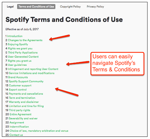
While there might not be any flair to their table of contents, users don’t have to scroll through page after page to learn about the guidelines on payments and cancellations. It’s puzzling why sites wouldn’t just spend a few minutes on their terms to help their visitors save hours.
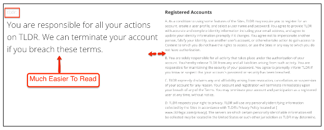
- Include TL;DRs with each section
The number one reason people have trouble reading through terms and conditions agreements is they are often written with legalese that only an attorney would understand.
Companies are beginning to address this problem by including a “Too Long; Didn’t Read” (TL;DR), or “short”’ version, that cuts through the legal jargon and gives visitors a layman’s version.
TLDRLegal’s terms of service does it best by organizing their page with the legalese version on the right and the layman’s version on the left. Which one would you rather read?
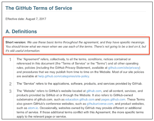
Github’s terms of service does something similar by including a ‘short version’ at the start of every section that gives a brief overview of what is covered and allows users to skim through the page faster.
- Use question mark popups
Another way to help people maneuver through the complicated legal jargon is to include FAQ-style popups like you see below:
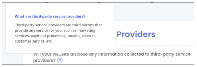
With these popups, people can hover over the terms or phrases they don’t quite understand and get a quick explainer which clarifies the definition.
- Sprinkle in icons & images
A plain wall of text page after page puts a strain on the eyes and can get boring real fast. Icons and images can be used not only to make your terms and conditions agreement more visually appealing, but to also help navigate the document.
Mailchimp uses icons to make it easier to discern the six different legal policies on their site:

Since Imperial College London is an educational institution, its terms and conditions are far more robust than that of the average website. Instead of having one long webpage, Imperial College breaks their terms into separate category pages using a menu of easily identifiable images:
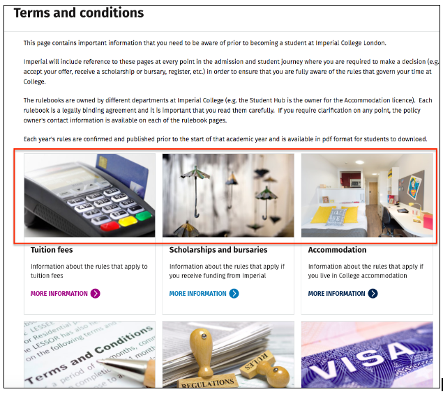
While most websites’ terms and conditions appear daunting and incredibly boring, the images on Imperial’s page make the terms feel more friendly and welcoming. Prospective students can find the specific policies they need without hassle and can get back to focusing on school.
- Don’t overlook fonts & spacing
The very least you can do to improve the readability of your terms is use a clear font style and size. The screenshot below of Kinja’s Terms of Use and Huffington Post’s terms and conditions demonstrate just how big a difference the font can make.
Which one is easier to read?
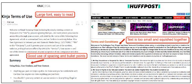
Kinja’s terms agreement is the obvious winner. They use a large font and enough space between lines to avoid making paragraphs look like an overcrowded block of text. On the other hand, Huffingpost’s font is way too small, and they don’t use a space between paragraphs, which makes their terms a nightmare to read (I had to use my finger to make sure I didn’t lose my place).
If you’re looking for the ideal font, most recommend sans serifs fonts for online reading.
- FAQ format
When most people visit a terms and conditions page, they come with questions. So instead of having them sift through paragraphs in search of an answer, why not have your terms address their questions upfront?
The BBC’s terms of use breaks each section into questions:
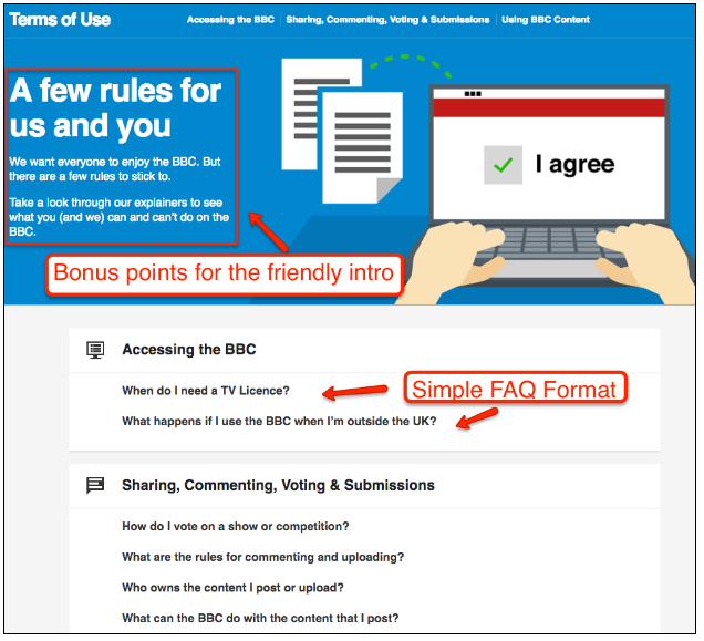
So instead of simply labeling a subsection “Content Ownership,” the BBC rephrases it as a question, “Who owns the content I post or upload?”, which is a common question users have. Formatting your terms this way makes the page more user friendly.
Final Words
No one in their right mind would recommend that you spend more time on your terms of use page than on your pillar pages. However, designers and webmasters should set aside some time to give their terms and conditions pages the attention that it needs. Most of the changes listed above can be done in less than a day, but can make a world of difference when it comes to how visitors perceiver your website.
Have any other cool ideas on how to improve the UX of a terms and conditions page? Comment below!
There is no ads to display, Please add some


