
2018 saw some fierce & bold, subtle and classic web designing styles, playing with space, fonts, colours, animations & more. As we step into the new year, we’d like to highlight the web design trends that blew us away in 2018 and are here to stay for 2019.
1) Minimalist Homepage
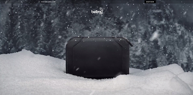
Minimalism is the single most important principle of web designing. Although this may be difficult to accept that the homepage contains little or no content, the design is clean, classy & attractive. From simplifying navigation to hiding icons, the reduced clutter helps focus on a single, powerful image or video known as the “hero image”. This has become a trend possibly because of larger screen sizes on devices today and higher screen resolution that allow for stunning displays and thereby much improved user experiences. Here are some of our favourites:
Courtesy: Bellroy
Courtesy: Born
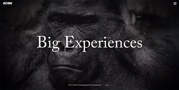
2018 saw a lot more websites follow this design. A big thumbs up from us!
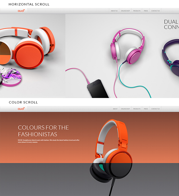
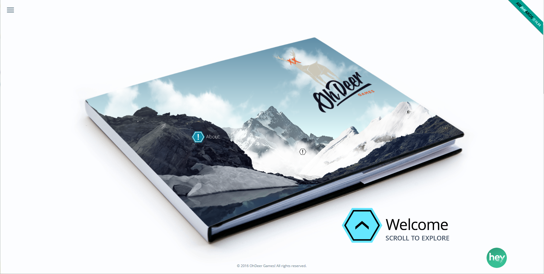
2) Creative Scrolls
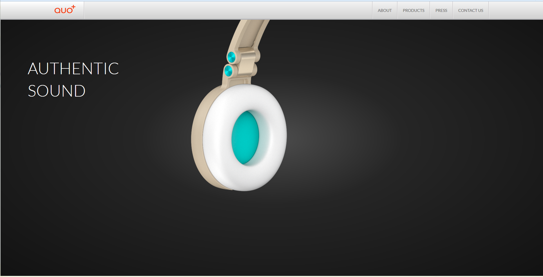
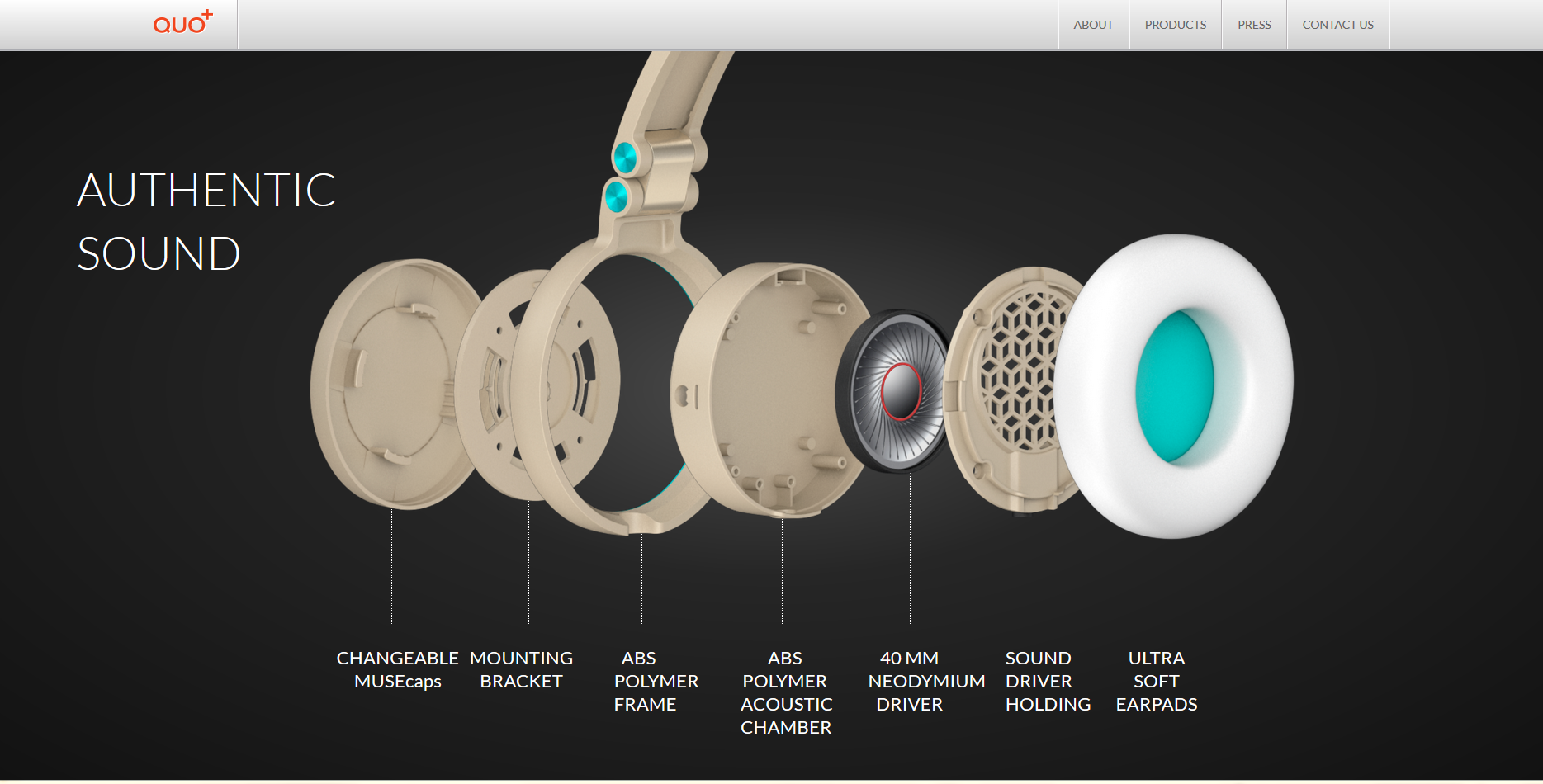
We love that the scroll has taken on more of a ‘role’ than just the vertical slide. The scroll has been used as a horizontal scroll, a colour scroll, a feature scroll, a tour scroll & so much more than what it started out as. We can attribute this trend to the boom of smart devices with touch screens in the recent years allowing for ‘swipe’ in the manner that the user may prefer rather than the conventional vertical scroll.
Courtesy: QUO+
Tour Scroll Courtesy: OhDeerGames
Do also take a look at Swiss Airlines‘ website too. We love how the scroll gives you a feel of flight take off while taking you through the features of the airline
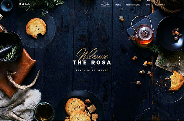
3) Innovative Page Layouts
2015 brought about a trend that introduced innovative page layouts. No longer are designers afraid to play with different layers, shapes, asymmetry, and angles. The trend helped move away from the standard front facing images, flat layouts to more asymmetrical and “edgy”. The screen rotation feature, the zoom feature, the HD display on smart devices probably cajoled designers to experiment and explore even allowing for more, realistic images. Images took quite the forefront in designs in the past year owing to image heavy sites like Pinterest, Flickr, Tumblr & Instagram in the recent years. Take a look at some of these designs with different page layouts.
Courtesy: The Rosa
Courtesy: DAN Paris
4) The Preloaders
We all dislike the ‘load’ icon primarily because it is those very seconds that makes us wait, get bored while we wait and wait some more. And although greater bandwidth and connectivity have reduced the load time, 2018 set the trend for visually appealing & engaging preloaders.
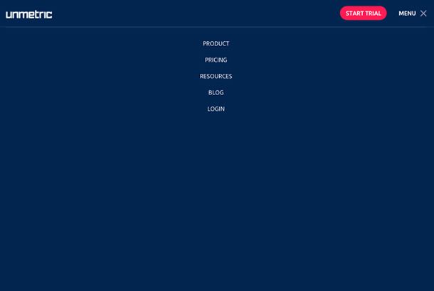
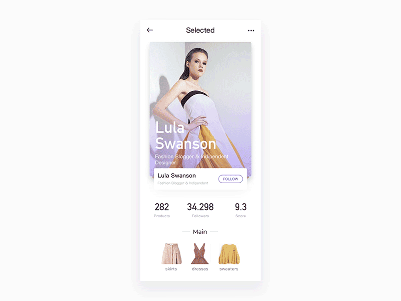
5) App-like Designs
Hidden navigation, cleaner designs, menus stacked under a single icon of 3-4 lines (also known as a “hamburger”), sidebars disappearing to make room for more content, all became quite a fad in 2018 when designers began taking into consideration the mobile-viewing market. More and more website designs mimic app designs due to the growing familiarity with app interfaces.
Courtesy: Unmetric
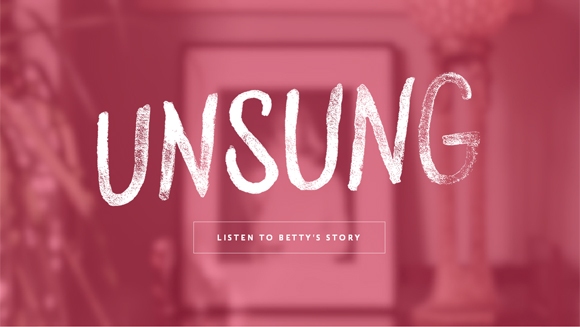
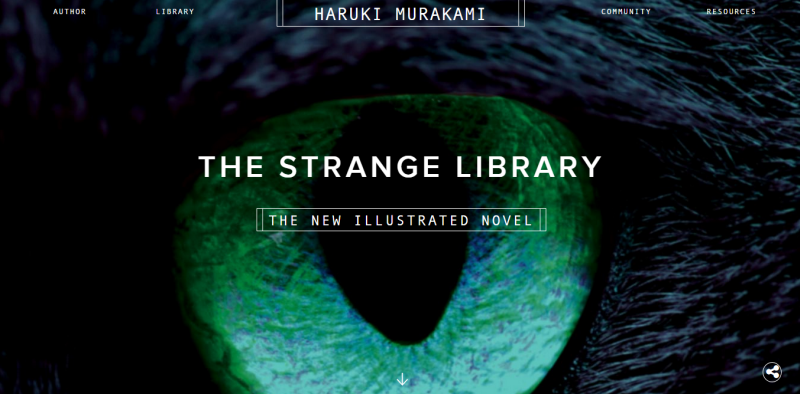
6) Ghost Buttons
From screaming, loud call-to-action buttons to transparent to translucent, less-obstructive, seamless, no-fill buttons, the evolution has been obvious in 2018 designs. These buttons compliment the minimalist design feel, making it a perfect fit. Like the app-like designs, the ghost buttons too became a full blown trend after apps became increasingly popular and users, familiar, all owing to the smart devices/ smart phone boom.
Courtesy: Unsung
Courtesy: Haruki Murakami
The trends in 2018 shifted the perception of websites from boring, cluttered, load-heavy to sleek, interesting & worth visiting, reviving the platform for marketing, show-casing & making the brand’s online presence worth it.
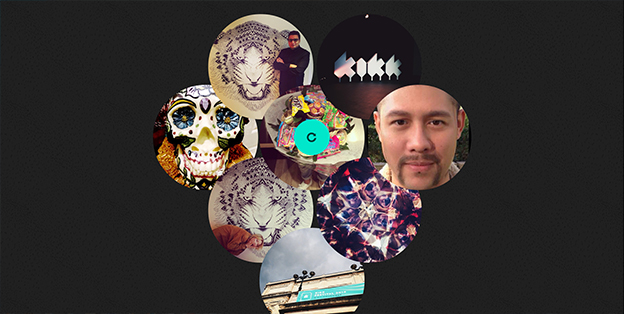
7) Micro Interactions
Micro-interactions are inviting and compel the user to explore more as they are visually stimulating in nature. Whenever you perform a certain task on a web page and there is a response it evokes micro-interaction. Micro-interactions aims to involve your user with your website to create a mutually expressive and smart environment.
For example, when you log in to your Instagram page and see a red dot on the heart symbol it signifies a micro-interaction. A chime, a beep, GIFs, hover and scrolling animations, and much more are all types of micro-interactions. 2019 is set to rely on and feature micro-interactions.
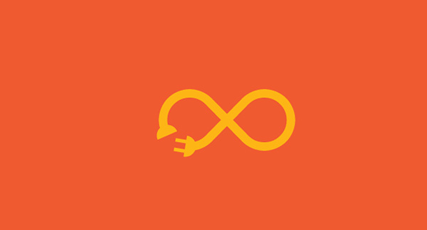
Courtesy: Wenwenzwy
We’re excited for all 2019 has to offer. Look out for an upcoming post on the path-breaking designs that are touted to create quite a stir this year!
*The above images are for illustration purposes only. ResellerClub has not claimed any copyright or IPR. Please contact us or leave a comment if you would like to be attributed.
Article updated in June 2019
There is no ads to display, Please add some


