I’d ask you not to take the term ‘hero’ banners too literally. They don’t wear capes or shoot weblines, but the visual impact it leaves on your visitors could surely save the day. When used well, they can make the difference between a longer visit and a bounce. Hero images can be a very valuable asset to your business.
The concept kicked off around 2014 and is now a staple element of web-design. Incorporating hero images can not only primp up the design of a web page, but also build depth into page content. Hero images are an integral part of your websites’ landing pages; the most important component of a successful website. Research shows that, your homepage often decides whether a visitor is going to be a potential conversion. Let’s dive deeper into how and why hero images are given the importance they deserve. Hero banners are:
1) Captivating

Firstly, they’re great to look at and encapsulate everything your landing page is supposed to represent. It’s simple and straight-forward messaging and that’s just the way it should be since it is a user’s first impression of the website.
2) Better than rotating carousels
I’ve noticed that many websites are obsessed with the idea of carousels on homepages. They’re popular, but in my opinion, it doesn’t improve UX and are generally ineffective. It usually takes a span of 15 seconds for the automatic slider to do its job and could therefore hide relevant content from the user. Let’s take a look at a few more reasons for why hero banners have become the next big thing:
- Rotating carousels may hide content
- They’re generally not compatible with mobile websites and have an impact on page load speed too (owing to heavy use of JavaScript and CSS)
- A case study published by Notre Dame University stated that sliders/carousels only have a 1% CTR
- Slider transitions could decrease content readability for your visitors (try reading the contents of a rotating carousel only to have it move away from you)
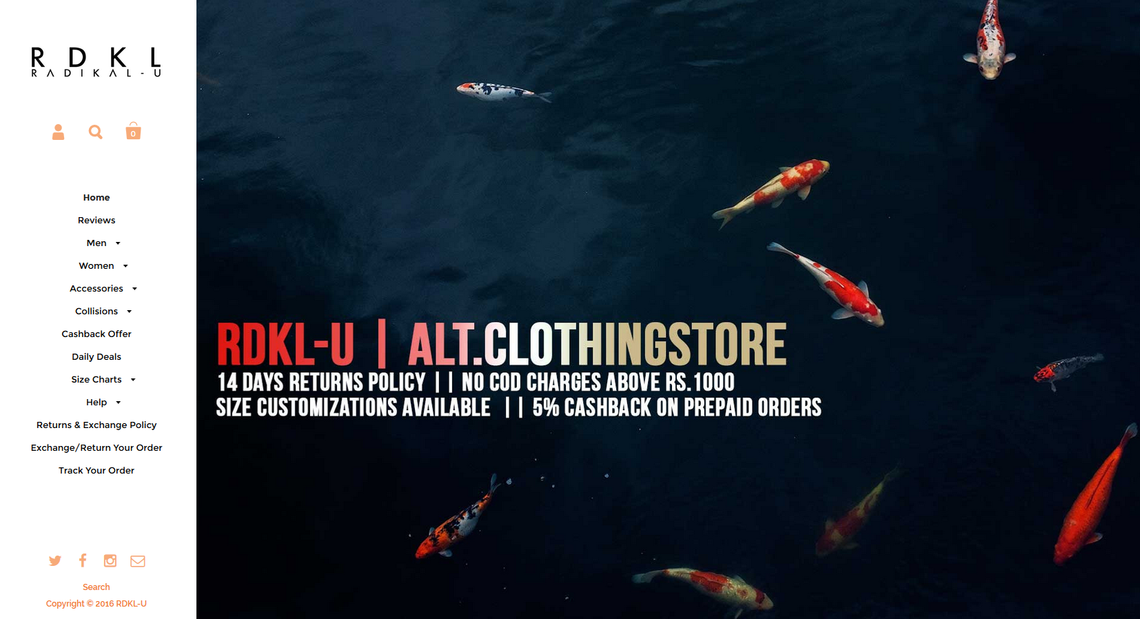
Then again, I’m not saying all sliders or rotating carousels are bad. They have their uses and as a web-designer, you must be pragmatic in knowing when to utilize what. Basically, replace sliders on homepages with hero banners that keep changing every few seconds. Take this e-commerce website for example:

3) Great at Increasing Conversions
The various points that I’ve covered above brings me to a single conclusion. Hero banners are more engaging than its predecessors. It’s primarily due to the fact that people are highly visual. So having high quality imagery at the top of your page can help create a positive first impression.
- Your avoid misguiding user with visual noise. For example, an automatic carousel could misguide visitors by taking away their attention from your USP; content of your site as well as the products or services you are offering
- Helps a visitor to intuitively find the desired content on a website
- It gives a visitor more control over what is being viewed avoiding any negative sentiment
- They do not hide any content unlike automatic sliders
Web designers have been experimenting with Hero Images – adding all sorts of animations & Parallax, video backgrounds etc. to enhance the overall look and feel of a website. So how can you optimize your web page space in the right manner to ensure that your users keep coming back? Let’s take a look at few important points to keep in mind.
How to design an effective Banner
The purpose of any Hero image is to captivate visitors with relevant content. As mentioned earlier, we are visually driven beings. The impact of natural selection over many years of evolution has blessed us with the most powerful weapon of all – the neo-cortex. It’s our center for logic, reason and the very concept of love. Over the course of time, we have used imagery to instill and provoke emotions. It’s this very philosophy that drives users to take initiative on your website. I’ve done a simple breakdown of how you can effectively use hero banners to give your customers’ website that extra edge.
The Image
Hero Banners are to be captivating by definition. Using an impactful, visually stimulating image is the first step. You can immediately grab a visitor’s attention by using rich and vibrant colours. Low resolution images can be a downer, so make sure you use a high resolution image for which you have ownership rights. You can refer to a few web designer tools to help up your game here.
Remember to:
- Create a new Photoshop file with the proper size to fit your image
- Decide how sharp you want your image to be, blur filters can used to shift focus towards certain components of the hero banner
- Decide how dark you want the image to be. You can edit the image directly by using a dark layer below it or simple by increasing or decreasing its opacity
Copy
This is what you want visitors to focus on. This, rakes in your ‘dollar dollar bills bills’. You can either have the text on the image itself or add text directly via HTML. This method helps to keep your website responsive because your visitors could be using various devices or even browsers for that matter.
Always make sure to:
- Use super bold title and the right font
- Use subtle cursive font for subtitles
- Give some extra letterspace when using uppercase for prominence
- Don’t use boring or irrelevant content, keep it simple and concise
- Keep content aligned with the objectives of the marketing and sales team – if you start diluting your page with reams of useless explanations about why a visitor should sign up or buy a product, your website is a no man’s land

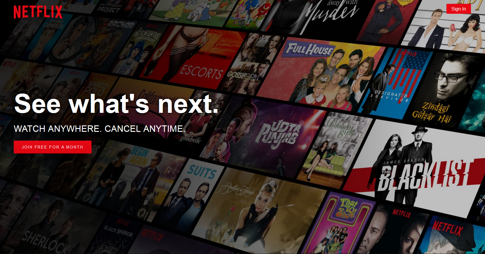
Let’s take the Netflix homepage as an example. It uses bold text. You can see the background is a collage of all your favorite films and series. Using a dark layer on the background really brings out focus on the text and most importantly, the call to actions; ‘Sign in’ and ‘Join free for a month’. There is a stark contrast between the dim background and the red call to action which really draws the visitor’s attention to the right areas of the website.
Conclusion
That all folks. Hero Banners not only added aesthetic value but are considered to be revenue generators as well. You should keep changing these images frequently to keep those visitors coming back for more and to drive them to take action that are most inline with your conversion goals.
How often do you use Hero Banners for building a client website? Do share your thoughts with us in the comments section below.
There is no ads to display, Please add some


